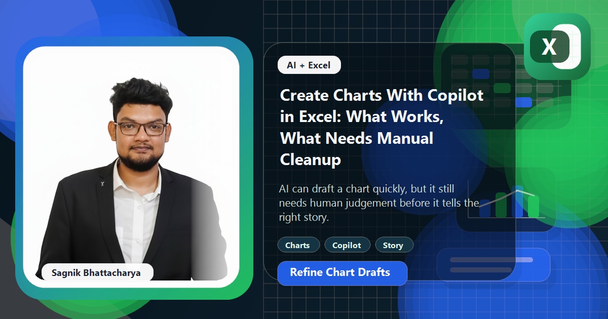
Chart creation looks like a perfect AI task because much of it is repetitive: choose a visual, map the fields, apply a title, and show the first draft quickly. Copilot can help with that first pass.
The catch is that a technically correct chart can still be a bad chart. Review is not optional just because the bars appear.
Quick answer
Use Copilot to draft charts quickly when the data is already clean and the reporting question is simple. Expect to do manual cleanup around chart choice, titles, labels, sorting, and the story you actually want the chart to tell.
- You need a quick first chart from a clean table.
- The reporting question is clear and bounded.
- You are happy to refine the result manually afterwards.
What works well
Copilot is useful for getting from blank sheet to first chart faster. That is especially helpful when you need an initial visual for discussion rather than a final presentation-ready asset.
Where manual cleanup still matters
Chart type, title quality, sorting, clutter, axis decisions, and annotation still need human judgement. Those are communication choices, not merely software actions.
How to review the first draft
Ask whether the chart answers the actual business question, whether the scale is honest, and whether a stakeholder could misread it. Then tidy the copy and formatting before sharing.
Worked example: monthly revenue variance
A finance lead wants a quick chart of revenue variance by month. Copilot creates the first visual, then the analyst changes the title, reorders the months correctly, and adds one annotation so the key movement is obvious.
Common mistakes
- Accepting the first chart type without thinking.
- Ignoring sorting or date-order issues.
- Sharing a draft chart as if AI chose the best narrative automatically.
When to use something else
If you need stronger charting fundamentals, professional charts in Excel is still the better foundation. If the real problem is data structure, format the source properly first.
Frequently asked questions
What is Copilot good for with charts?
Getting from a blank sheet to a first chart fast when the data is already clean and the question is simple. That is great for an initial visual to discuss, less so for a final, presentation-ready asset.
What still needs manual cleanup?
Chart type, title quality, sorting, clutter, axis decisions, and annotation. Those are communication choices that need human judgement, not just software actions.
How do I review a Copilot chart?
Ask whether it answers the actual business question, whether the scale is honest, and whether a stakeholder could misread it, then tidy the labels and formatting before sharing.
Does Copilot pick the right chart type?
Not always. It defaults to common types, so you often need to switch - a bar for ranking, a line for trend - to match the message. Chart type is a judgement call.
Why does my Copilot chart look cluttered?
It tends to include everything rather than the one thing you want to show. Remove series, gridlines, and labels that do not serve the message; less is usually clearer.
Should I trust Copilot's chart titles and labels?
Treat them as placeholders. Rewrite the title to state the takeaway, and check axis labels and number formats, because clear copy is what makes a chart communicate.
Related guides on this site
If you want to keep going without opening dead ends, these are the most useful next reads from this site.
- Format Data for Copilot in Excel: Tables, Supported Ranges, and Common Failures
- How to Review AI-Generated Excel Formulas Before You Trust Them
- ChatGPT vs Claude vs Copilot vs Gemini for Excel in 2026
- Text Analysis in Excel With AI: Survey Comments, Reviews, and Open Feedback
- Map Charts in Excel: When to Use Them, Data Prep, and Common Mistakes
- How to Make Professional Charts in Excel (Step-by-Step Guide)
Official references
These official references are useful if you need the product or framework documentation alongside this guide.