Putting a widget exactly where you want it — dead centre, hugged into a corner, or somewhere precise in between — comes down to two widgets and one small coordinate system. Center handles the everyday case, Align handles everything else, and the Alignment value that drives both is just an (x, y) pair from -1 to 1. This guide makes that system concrete, with paste-ready code for every placement you'll reach for.

The Complete Flutter Guide: Build Android, iOS and Web apps
Go from scratch to building industry-standard apps with Riverpod, Firebase, animations, REST APIs, and more.
Enrol nowEvery snippet below is paste-ready against current stable Flutter. Alignment shows up again the moment you start layering widgets, so the Stack and Positioned guide is a natural next step once these two widgets click.
We'll start with Center, unpack the Alignment coordinate system, use Align for off-centre placement, cover widthFactor/heightFactor, look at the directional variant for right-to-left apps, and finish with how Align behaves inside a Stack.
If a moving demonstration helps more than a static snippet, the channel builds these placements live so you can see exactly how the coordinate values map to the screen.
Center: the common case
Center places its child in the middle of the space its parent gives it. It's the widget you reach for to centre a loading spinner, an empty-state message, or a single hero element on a screen.
Center(
  child: CircularProgressIndicator(),
)
For this to work the parent must offer bounded space — Center expands to fill what it's given, then sits the child in the middle. Inside a full-screen Scaffold body that's automatic. Note that to centre children within a Row or Column you use MainAxisAlignment.center and CrossAxisAlignment.center instead, covered in the Row and Column guide — Center is for a single child in a bounded box.
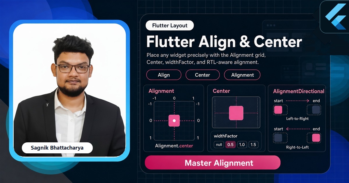
The Alignment coordinate system
Everything Align does rests on the Alignment type, which is an (x, y) pair where each axis runs from -1 to 1. The origin is the centre, the corners are the extremes:
Alignment(0, 0)    // centre
Alignment(-1, -1)  // top-left
Alignment(1, -1)   // top-right
Alignment(-1, 1)   // bottom-left
Alignment(1, 1)    // bottom-right
You rarely type the numbers, because Flutter ships named constants for the nine common points: Alignment.topLeft, Alignment.topCenter, Alignment.centerRight, Alignment.bottomCenter, and so on. But the numbers are always available when you need something between the named points — Alignment(0.3, -0.6) is perfectly valid, and values beyond -1 to 1 push the child outside the box entirely.
Align: place a child anywhere
Align takes an alignment and positions its child at that point within the available space.
Align(
  alignment: Alignment.bottomRight,
  child: FloatingActionButton(
    onPressed: () {},
    child: const Icon(Icons.add),
  ),
)
This is the idiomatic way to tuck a badge into a corner, drop a caption at the bottom of an image, or pin a button to one edge of a panel. Because Center is literally Align with alignment: Alignment.center, learning Align means you've learned both — Center is just the name for the most common value.
Position anything, on any screen size
The Complete Flutter Guide covers alignment, layering, and responsive placement from first principles through to shipped apps.
Enrol nowwidthFactor and heightFactor
By default Align grows to fill the space its parent allows, then positions the child inside. Set widthFactor or heightFactor and Align instead sizes itself to a multiple of the child's own size on that axis.
Align(
  alignment: Alignment.center,
  heightFactor: 2,   // Align becomes twice the child's height
  child: const Text('Padded above and below by my own height'),
)
With heightFactor: 2 the Align is exactly twice as tall as its child, so the child sits centred with one child-height of space split above and below. It's a compact way to give a single widget proportional breathing room without measuring anything — and a useful tool when a parent would otherwise force Align to fill more space than you want.
AlignmentDirectional for RTL
Just like with padding, hard-coded left/right alignment doesn't mirror for right-to-left languages. AlignmentDirectional swaps the horizontal axis for start/end so placement flips with the locale.
Align(
  alignment: AlignmentDirectional.centerStart,
  child: Text('Hugs the leading edge in any language'),
)
In English centerStart aligns to the left; in Arabic the same code aligns to the right. Use it whenever a corner or edge placement needs to respect text direction. The related FractionalOffset describes the same idea with a 0-to-1 origin at the top-left instead of a centred -1-to-1 system, occasionally handy when porting design specs that already think in fractions.
Align inside a Stack
Align is especially common inside a Stack, where it's an alternative to Positioned for edge and corner placement. Where Positioned wants explicit pixel offsets, Align expresses placement proportionally, which adapts more gracefully across screen sizes.
Stack(
  children: [
    const ColoredBox(color: Colors.indigo),
    Align(
      alignment: Alignment.topRight,
      child: Padding(
        padding: const EdgeInsets.all(8),
        child: const Icon(Icons.favorite, color: Colors.white),
      ),
    ),
  ],
)
Inside a Stack, each non-positioned child is laid out according to the Stack's own alignment; wrapping one child in Align overrides that for just that child. Reach for it when "top-right corner regardless of screen size" reads more clearly than a pixel offset.
Choosing the right tool
- Use
Centerto place a single child in the middle of a bounded space. - Use
Alignfor any other placement — corners, edges, or a preciseAlignment(x, y). - Use
widthFactor/heightFactorwhen Align should size to the child rather than fill the parent. - Use
AlignmentDirectionalin any app that supports right-to-left languages. - Use Row/Column alignment instead when you're positioning multiple children along an axis, not a single child in a box.
Common mistakes
- Expecting Center to work in unbounded space. If the parent doesn't constrain the axis, Center has no region to centre within — it sizes to the child instead.
- Using Align to centre children of a Row or Column. Use
MainAxisAlignment/CrossAxisAlignmentthere; Align is for a single child. - Forgetting the y-axis points down.
-1is the top and1is the bottom, which is the opposite of a maths graph. - Hard-coding left/right alignment in localised apps. Use
AlignmentDirectionalso corners mirror in RTL. - Stacking Align and Padding when one Alignment would do. A single
Alignment(x, y)often expresses the offset more directly than nesting widgets.
Frequently asked questions
What is the difference between Align and Center in Flutter?
Center places its child in the middle; Align places it at any Alignment you specify. Center is Align with alignment: Alignment.center.
How does the Alignment coordinate system work in Flutter?
It's an (x, y) pair from -1 to 1: (0, 0) is the centre, (-1, -1) the top-left, (1, 1) the bottom-right. Named constants cover the common points.
What do widthFactor and heightFactor do on Align?
They make Align size itself to a multiple of the child's size on that axis instead of filling the parent — heightFactor: 2 makes Align twice the child's height.
How do I centre a widget in Flutter?
Wrap it in Center for a single child, or use MainAxisAlignment.center/CrossAxisAlignment.center inside a Row or Column.
Further reads
Keep going with the tutorials that pair with this guide:
- Flutter Development Guide 2026 — the full Flutter hub.
- Flutter Layout Widgets: The Complete Guide — every layout widget and the constraints rule.
- Flutter Stack and Positioned — Align as an alternative to Positioned for layered placement.
- Flutter Container Widget Explained — the
alignmentproperty for positioning a Container's child. - Flutter Padding, Margin, and EdgeInsets — adding space around an aligned child.
Sources: Flutter documentation — Align, Center, Alignment, AlignmentDirectional, and FractionalOffset API references, plus the Layout guide (docs.flutter.dev). Verified against current stable Flutter.