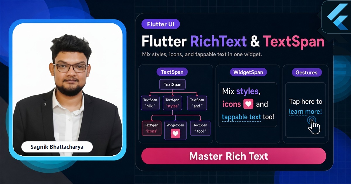
Sooner or later you need one word bold in the middle of a sentence, a coloured price next to plain label text, or a tappable "Terms" link inside a paragraph. A plain Text can't do that — it styles the whole string at once. RichText and its building block TextSpan let you compose many styles into a single, flowing piece of text. This guide covers the span tree, the Text.rich shortcut, inline widgets, tappable spans, and accessibility, with paste-ready code.

The Complete Flutter Guide: Build Android, iOS and Web apps
Go from scratch to building industry-standard apps with Riverpod, Firebase, animations, REST APIs, and more.
Enrol nowEvery snippet below is paste-ready against current stable Flutter. If you haven't styled a single string yet, the Text and TextStyle guide is the prerequisite — every span here carries a TextStyle, so the properties there apply directly.
We'll start with the TextSpan tree, see why RichText needs an explicit base style, switch to the friendlier Text.rich, embed icons with WidgetSpan, make a span tappable, and finish on accessibility.
If watching helps more than reading, the channel builds inline links and mixed-style labels into real screens so you can see the span tree take shape.
The TextSpan tree
A TextSpan has its own text and style, plus a list of children spans. Children inherit the parent's style and override only what they change, so you set a base once and layer differences on top.
RichText(
  text: TextSpan(
    style: const TextStyle(color: Colors.black87, fontSize: 16),
    children: [
      const TextSpan(text: 'Total: '),
      TextSpan(
        text: '£49',
        style: const TextStyle(
          fontWeight: FontWeight.bold,
          color: Colors.green,
        ),
      ),
      const TextSpan(text: ' per seat'),
    ],
  ),
)
The whole thing flows and wraps as one paragraph — break a line mid-phrase and the bold price stays bold. That's the key advantage over lining up separate Text widgets in a Row, which can't wrap as a single sentence.
RichText needs a base style
One gotcha catches everyone: RichText does not read DefaultTextStyle. A bare Text inherits a sensible colour and size from its Material ancestors, but RichText starts from nothing, so if you omit the root span's style your text can render in the unstyled default. Always set a base style on the root TextSpan — often by pulling in the ambient default explicitly.
RichText(
  text: TextSpan(
    style: DefaultTextStyle.of(context).style, // adopt the ambient style
    children: const [
      TextSpan(text: 'Reads like the rest of the screen, '),
      TextSpan(text: 'with emphasis here.',
          style: TextStyle(fontStyle: FontStyle.italic)),
    ],
  ),
)
Text.rich: the friendlier form
Most of the time you don't need raw RichText at all. Text.rich takes the same TextSpan tree but behaves like a normal Text — it inherits DefaultTextStyle, so the base-style gotcha disappears, and it accepts familiar arguments like maxLines and textAlign.
Text.rich(
  TextSpan(
    children: [
      const TextSpan(text: 'By continuing you agree to our '),
      TextSpan(
        text: 'Terms',
        style: TextStyle(
          color: Colors.indigo,
          fontWeight: FontWeight.w600,
        ),
      ),
      const TextSpan(text: '.'),
    ],
  ),
  textAlign: TextAlign.center,
)
Reach for Text.rich by default and drop to RichText only when you specifically don't want default-style inheritance. They share the same span model, so nothing else changes.
Build real UI text, not lorem ipsum
The Complete Flutter Guide covers inline links, badges, and rich labels inside production screens from first principles.
Enrol nowInline icons with WidgetSpan
A TextSpan only holds text, but a WidgetSpan can hold any widget and lay it out inline with the surrounding glyphs — an icon, a small avatar, a badge. It's how you put a verified tick right after a username without breaking the line.
Text.rich(
  TextSpan(
    children: [
      const TextSpan(text: 'sagnikteaches '),
      WidgetSpan(
        alignment: PlaceholderAlignment.middle,
        child: Icon(Icons.verified, size: 16, color: Colors.blue),
      ),
    ],
  ),
)
The alignment argument controls how the widget sits against the text baseline — PlaceholderAlignment.middle centres a small icon on the line, which looks right for inline ticks and chips.
Tappable spans
To make one span respond to taps, attach a TapGestureRecognizer with an onTap callback. Because a recogniser holds resources, create it in a StatefulWidget and dispose of it — leaking recognisers is a real, if quiet, memory bug.
// Inside a State class:
late final TapGestureRecognizer _termsTap;

@override
void initState() {
  super.initState();
  _termsTap = TapGestureRecognizer()..onTap = _openTerms;
}

@override
void dispose() {
  _termsTap.dispose(); // don't leak the recogniser
  super.dispose();
}

// In build():
TextSpan(
  text: 'Terms',
  style: const TextStyle(color: Colors.indigo),
  recognizer: _termsTap,
)
This is the canonical pattern for inline links in legal copy, "read more" toggles, and @-mentions. For a whole-widget tap rather than a span, a GestureDetector or button is simpler — recognisers are specifically for sub-spans of text.
Accessibility
Screen readers announce the concatenated text of the span tree, which is usually correct. When the visual text differs from what should be read — say a price written "£49" that you'd like read as "forty-nine pounds" — pass a semanticsLabel on the Text.rich to override the spoken version while keeping the visual one intact.
Common mistakes
- Forgetting RichText's base style. It doesn't inherit
DefaultTextStyle; set the root span's style or useText.rich. - Leaking a TapGestureRecognizer. Create it in
initStateand calldispose()on it. - Using a Row of Texts for one sentence. It can't wrap mid-phrase; use a span tree so the styled pieces flow together.
- Reaching for RichText to style a whole string. If every character shares a style, a plain Text is simpler.
- Misaligning WidgetSpan children. Set
PlaceholderAlignmentso inline icons sit on the baseline, not above or below the line.
Frequently asked questions
What is the difference between RichText and Text in Flutter?
Text styles one string uniformly; RichText renders a tree of TextSpan pieces, each with its own style. RichText doesn't inherit DefaultTextStyle, so set a base style or use Text.rich.
How do I make part of a Text tappable in Flutter?
Attach a TapGestureRecognizer to the TextSpan and set onTap. Create it in a StatefulWidget and dispose of it.
How do I put an icon inline with text in Flutter?
Use a WidgetSpan in the span tree; it can hold any widget and lays it out inline, aligned via PlaceholderAlignment.
Should I use RichText or multiple Text widgets in a Row?
Use RichText/Text.rich for one flowing sentence that wraps together; a Row of Texts can't wrap mid-phrase and breaks awkwardly on narrow screens.
Further reads
Keep going with the tutorials that pair with this guide:
- Flutter Development Guide 2026 — the full Flutter hub.
- Flutter Text and TextStyle — the styling each span carries, in depth.
- Flutter Material Widgets: The Complete Catalogue — buttons and tiles your rich text sits beside.
- Flutter Container Widget Explained — the box you place a rich-text paragraph inside.
- Flutter Icons and IconButton — the icons you embed inline with WidgetSpan.
- Flutter Layout Widgets: The Complete Guide — the layout context text renders into.
Sources: Flutter documentation — RichText, TextSpan, Text.rich, WidgetSpan, PlaceholderAlignment, and TapGestureRecognizer API references, plus the Typography guide (docs.flutter.dev). Verified against current stable Flutter.