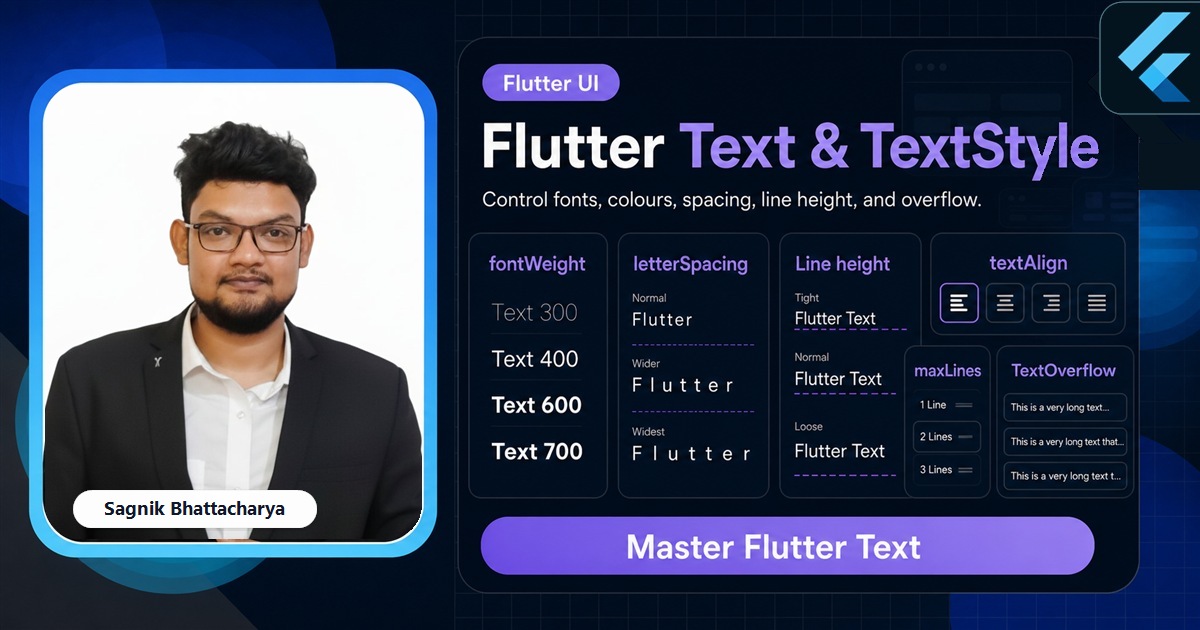
Text is the most-used widget in any app, and the one people customise least carefully. Text shows a string; TextStyle controls how it looks — size, weight, colour, spacing, and line height — and a small set of properties decide what happens when the string is longer than the space it's given. This guide covers TextStyle end to end, the maxLines/TextOverflow pair that tames long strings, and how to lean on the theme so your typography stays consistent, all with paste-ready code.

The Complete Flutter Guide: Build Android, iOS and Web apps
Go from scratch to building industry-standard apps with Riverpod, Firebase, animations, REST APIs, and more.
Enrol nowEvery snippet below is paste-ready against current stable Flutter. When a single Text needs more than one style — a bold word mid-sentence, an inline icon — that's a job for RichText and TextSpan, the companion to this guide; here we focus on styling a whole string at once.
We'll work through the Text widget itself, the TextStyle properties you set most, alignment and line height, the overflow controls, accessibility text scaling, and how to reuse styles through DefaultTextStyle and the theme.
If you'd rather watch typography decisions made in a real screen, the channel builds these styles into shipped layouts rather than isolated snippets.
The Text widget and TextStyle
At its simplest Text takes a string. To style it you pass a TextStyle — a value object describing every visual property of the glyphs.
Text(
  'Coding Liquids',
  style: TextStyle(
    fontSize: 18,
    fontWeight: FontWeight.w600,   // semi-bold; w400 is regular, w700 is bold
    fontStyle: FontStyle.italic,
    color: Colors.brown.shade800,
    letterSpacing: 0.4,            // tracking between letters
  ),
)
fontWeight runs from FontWeight.w100 to w900, with FontWeight.normal (w400) and FontWeight.bold (w700) as named shortcuts. letterSpacing and wordSpacing add or remove space between letters and words, and decoration: TextDecoration.underline adds underlines or strikethroughs. These are the properties you'll reach for in almost every styled string.
Line height and alignment
Two properties shape blocks of text rather than individual glyphs. height on the TextStyle sets the line height as a multiple of the font size — not a pixel value — and textAlign on the Text controls horizontal alignment.
Text(
  'A longer paragraph that wraps across multiple lines reads much '
  'more comfortably with a touch more line height.',
  textAlign: TextAlign.justify,
  style: TextStyle(fontSize: 16, height: 1.5), // 16 × 1.5 = 24px line height
)
A height of 1.4–1.6 is the single biggest improvement you can make to readability on long copy. textAlign accepts left, right, center, justify, and the locale-aware start/end — prefer the directional pair when your app supports right-to-left languages.
Handling overflow: maxLines and TextOverflow
When a string is longer than its box, you decide what happens with two properties. maxLines caps how many lines render; overflow says how to treat the text that doesn't fit.
Text(
  'This headline is too long to fit on one line in a narrow card',
  maxLines: 1,
  overflow: TextOverflow.ellipsis,   // adds a trailing …
)
TextOverflow has four values: ellipsis (the trailing dots), clip (hard cut), fade (a soft fade-out), and visible (let it spill, overlapping siblings). One catch trips everyone up: inside a Row, a Text has unbounded width and never ellipsises — wrap it in Expanded or Flexible so it has a finite width to truncate within.
Typography that looks intentional
The Complete Flutter Guide covers a real type scale, theming, and overflow handling from first principles through to shipped apps.
Enrol nowRespect the user's text size
Operating systems let users scale text up for accessibility, and Flutter honours that automatically through TextScaler. Your fontSize is a base that gets multiplied by the user's setting, so a layout that only works at the default size will break for someone who has bumped their font scale.
// Read the current scaler if you need to reason about it:
final scaler = MediaQuery.textScalerOf(context);
final scaled = scaler.scale(16); // 16px at the user's chosen scale
The practical takeaway is not to fight scaling but to design for it: avoid fixed-height boxes around text, allow wrapping, and test at a larger text size. Hard-coding pixel-perfect text containers is the most common reason an app looks broken on a device with accessibility scaling turned up.
Reuse styles with the theme
Typing a TextStyle at every call site leads to drift — slightly different sizes and weights creeping in across screens. Define your type scale once on ThemeData.textTheme and read it with Theme.of(context).
Text(
  'Section heading',
  style: Theme.of(context).textTheme.titleLarge,
)

// Tweak a theme style without redefining it:
Text(
  'Muted caption',
  style: Theme.of(context).textTheme.bodySmall
      ?.copyWith(color: Colors.grey.shade600),
)
The Material 3 text theme ships named roles — displayLarge, headlineMedium, titleLarge, bodyLarge, labelSmall, and more — so you pick a role rather than a pixel size. Below the theme sits DefaultTextStyle, the inherited style a bare Text falls back to; wrapping a subtree in your own DefaultTextStyle sets a baseline that each Text merges its own style on top of.
Common mistakes
- Setting
heightin pixels. It's a multiple of font size —height: 24means 24× the font size, not 24px. - Expecting ellipsis inside a Row to just work. Wrap the
TextinExpanded/Flexibleso it has a bounded width to truncate within. - Hard-coding text box heights. Breaks under accessibility text scaling; let text wrap and size itself.
- Repeating the same TextStyle everywhere. Define it on the theme's
textThemeand read it withTheme.of(context). - Reaching for RichText to bold one word. If the whole string shares a style, a plain
Textis enough; use RichText only for mixed styles.
Frequently asked questions
How do I change text colour and size in Flutter?
Pass a TextStyle with color and fontSize to the Text widget's style argument; use fontWeight for boldness and fontStyle for italics.
How do I stop text overflow in Flutter?
Set maxLines and overflow: TextOverflow.ellipsis. Inside a Row, wrap the Text in Expanded or Flexible so it has a bounded width.
What is the height property in Flutter TextStyle?
Line height as a multiple of font size — height: 1.5 with a 16px font yields a 24px line height.
What is DefaultTextStyle in Flutter?
An inherited style that Text widgets use when they don't set their own. Material widgets provide one; you can wrap a subtree in your own to set a baseline.
Further reads
Keep going with the tutorials that pair with this guide:
- Flutter Development Guide 2026 — the full Flutter hub.
- Flutter RichText and TextSpan — multiple styles, inline icons, and tappable spans in one Text.
- Flutter Material Widgets: The Complete Catalogue — the components your styled text lives inside.
- Flutter Expanded vs Flexible vs Spacer — give a Text bounded width so ellipsis works.
- Flutter Icons and IconButton — the icons that sit beside your labels.
- Flutter Layout Widgets: The Complete Guide — the layout context text renders into.
Sources: Flutter documentation — Text, TextStyle, TextOverflow, TextAlign, DefaultTextStyle, TextTheme, and TextScaler API references, plus the Typography and Material 3 guides (docs.flutter.dev). Verified against current stable Flutter.